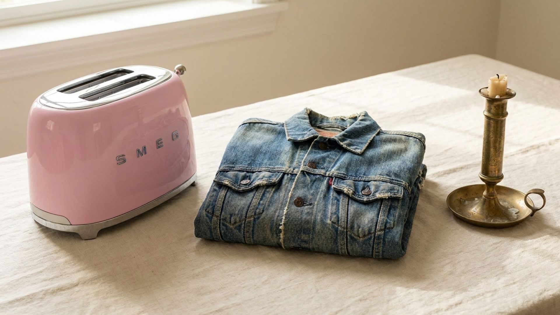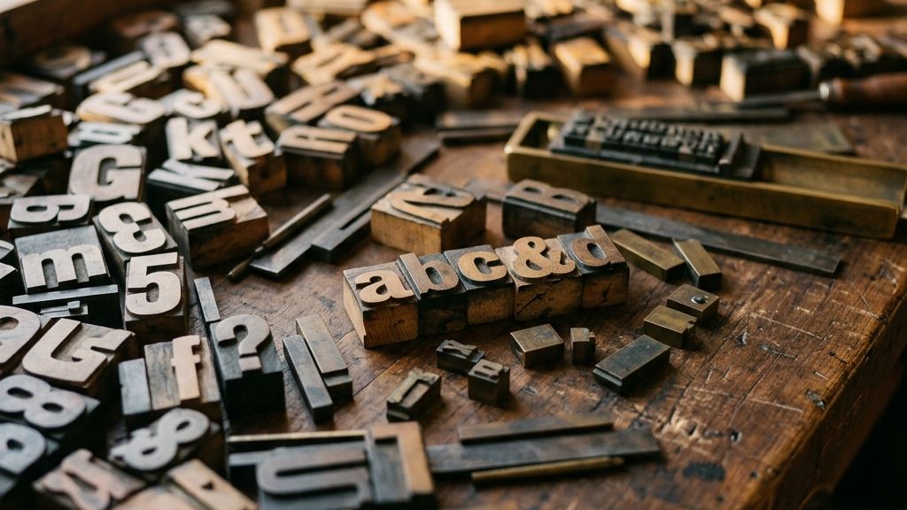
Pick any image that screams “1950s” in your head — diner counter, Coca-Cola ad, drive-in marquee. Notice what’s doing most of the work? It isn’t the chrome. It isn’t the cars. It’s the typography. Three or four letterforms placed in the right context can do what an entire mood board struggles to achieve.
The same is true for every other era. Art Deco doesn’t live in the geometric patterns — it lives in the letters on a Chrysler Building elevator door. Synthwave doesn’t live in the gradient — it lives in the chunky outlined sans that spells out “Miami.” Typography is the single fastest way to transport a design through time.
Below: 25+ genuinely retro fonts, organized by era, every single one free and licensed for commercial use. No fine print, no personal-only catches — all sourced from Google Fonts under the SIL Open Font License.
The Four Rules of Free Retro Fonts
Before the list, four principles that will save you hours of testing.
1. Define the era first, font second. A 1950s diner project doesn’t need “a retro font” — it needs a 1950s font. Searching by era is twice as fast as scrolling through generic “vintage” font lists.
2. Display, not body. Retro fonts are almost always display faces, meant for headlines, posters, and logos. Setting body copy in a retro font is the most common amateur mistake. Pair your retro display font with a clean, neutral body font.
3. License before love. “Free” doesn’t always mean “free for commercial use.” Google Fonts is the safest bet — every font there is released under the SIL Open Font License or Apache License, both fully commercial-friendly. DaFont and similar sites mix personal-only and commercial-free; always check.
4. One retro font per design. Layering two competing retro fonts in the same composition rarely works. Pick one hero display font, pair it with one clean body face, and let the era do the talking.
Era 1: Art Deco — The 1920s & 1930s
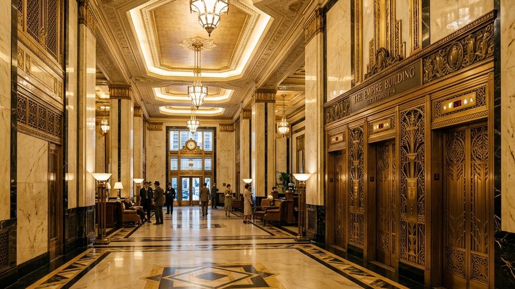
Art Deco typography was geometric, ornamental, and confident. It belonged to the age of grand hotels, ocean liners, and Hollywood premieres. The letterforms are tall, elegant, and built from straight lines and clean curves — no humanist warmth, just architectural precision.
Use Art Deco fonts for: cocktail menus, wedding invitations, hotel branding, anything that wants to feel pre-war glamorous.
Top pick: Limelight. A high-contrast Art Deco display face with the unmistakable elegance of 1930s movie posters. Use it large, give it room, and let it carry the whole design.
Honorable mentions: Poiret One is more geometric and modern-feeling — better when you want Deco influence without literal pastiche. Fascinate Inline brings the engraved-double-line effect found on Art Deco hotel signage. Righteous is the workhorse Art Deco-inspired sans for when you need geometry without ornamentation.
Era 2: Mid-Century Diner — The 1940s & 1950s
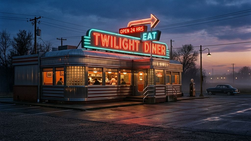
The 1950s gave us two complementary typography traditions: bold, optimistic sans-serifs (think advertising layouts from LIFE magazine), and warm, hand-painted scripts (think diner signs and Coca-Cola). Both convey post-war American optimism — confident, friendly, slightly nostalgic even when they were new.
Use mid-century fonts for: diner menus, brand logos with a friendly feel, retro packaging, anything that wants to read as “warm and Americana.”
Top pick: Lobster. Possibly the most recognizable free retro script on the internet — designed by Pablo Impallari, it has appeared on so many small-business signs that it’s almost become its own genre. The italicized brush-script feels straight off a 1955 milkshake glass.
Honorable mentions: Pacifico is the cool surf-shop cousin of Lobster — slightly more relaxed, perfect for beachside or California-leaning projects. Bowlby One is the bold, chunky 1950s ad font, ideal for posters that need to shout. Yesteryear has a chrome-script quality that suits automotive and high-end vintage branding. Playball brings a more elegant 1950s sports-page feel.
Era 3: Groove & Funk — The 1960s & 1970s
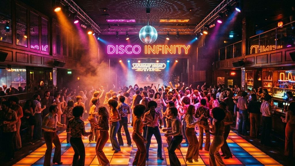
This is the era where typography got loud, curvy, and unapologetically decorative. Album covers, concert posters, sitcom titles, and disco signage all leaned into bold geometric display forms — often with neon, lights, or extreme outlining built right into the letterforms.
Use 60s/70s fonts for: music branding, posters, T-shirt graphics, anything that wants to feel funky, optimistic, or psychedelic.
Top pick: Monoton. A single-weight display face with internal stripes that mimic neon tubing — designed specifically to evoke 1970s nightclub and motel signage. Set it large and the era hits immediately.
Honorable mentions: Caprasimo has the soft, playful curves of 1970s children’s book titles and game shows. Bungee Inline is the modern descendant of the 1970s outlined-display tradition — its inline detail reads as both retro and contemporary. Ranchers leans more Western-funk hybrid, working for everything from rodeo posters to country-rock album art.
Era 4: Synthwave & Tech — The 1980s
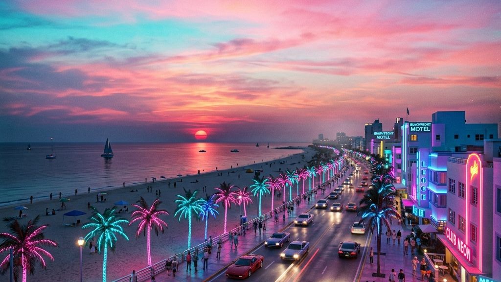
The 80s gave us two parallel typographic universes: the optimistic neon synthwave aesthetic (Miami Vice, the early MTV era, sci-fi VHS covers) and the chunky pixel aesthetic of early arcade games and home computers. Both feel resolutely “1980s” — but in completely different visual languages.
Use 80s fonts for: synthwave music branding, game design, sci-fi or futurist projects, anything VHS-coded.
Top pick: Audiowide. The defining free synthwave font — wide, chunky, with that unmistakable rounded-corner futurist feel. Pair it with a magenta-to-cyan gradient and you’re 80% of the way to a 1985 movie poster.
Honorable mentions: Press Start 2P is the pixelated 8-bit arcade font — perfect for retro gaming branding (it’s literally modeled on Namco’s 1980s arcade typography). Russo One is the bolder, less stylized 80s sans for when Audiowide is too much. Major Mono Display delivers a more refined sci-fi feel. VT323 captures the green-CRT terminal aesthetic of early home computers — ideal for cyberpunk and Y2K-coded work.
Era 5: Wild West — Any Era
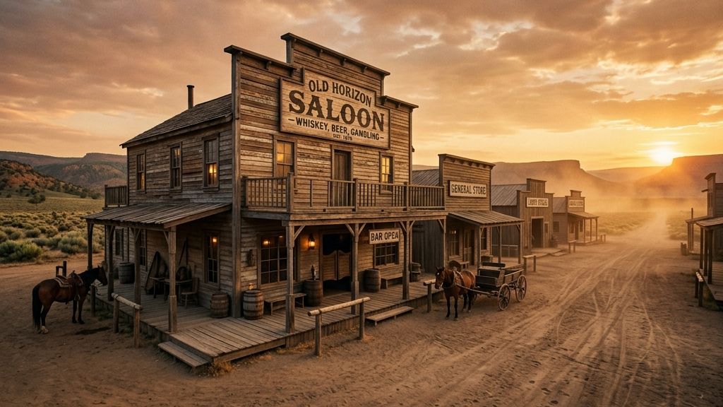
Western typography sits outside any single decade — the visual language of saloon signs and frontier posters has remained remarkably consistent from the 1880s through every Western movie since. Slab serifs, heavy stroke contrast, and decorative inline details. When you need this aesthetic, you need it on purpose.
Use Western fonts for: rodeo events, country music branding, BBQ restaurants, whiskey brands, anything that wants to feel frontier American.
Top pick: Rye. A classic Tuscan-style Western slab with the wedge-shaped serifs that immediately read as “saloon door swinging open.” Versatile enough to work for both literal Western projects and broader Americana branding.
Honorable mentions: Smokum has more decorative inline detail — better for nameplates and headlines that need to feel hand-carved. Sancreek leans heavier and more frontier-rustic.
Where to Find More Free Retro Fonts
Google Fonts is the safest source — every font is free for commercial use, hosted on a fast CDN, and easy to embed. But there are other libraries worth knowing:
Google Fonts — The default. Search by category, language, and properties. Every font is open-source and commercial-safe.
Font Squirrel — A curated archive of free-for-commercial-use fonts pulled from across the web. Stricter quality filter than DaFont — every font listed has been verified for commercial licensing.
DaFont — Massive catalog of designer-submitted fonts. Excellent retro selection, but check the license on each font individually — many are personal-use only or require attribution. Look for the “100% free” badge.
Creative Market — Mostly paid, but they release 6 free files every Monday, often including fonts. Worth bookmarking for the weekly drop.
Pixel Surplus — A boutique foundry with a small but strong free-fonts section, leaning toward bold display and retro-influenced faces.
Font Diner — A foundry specializing exclusively in retro typography. Mostly paid, but the free section has authentic vintage display fonts you won’t find elsewhere.
How to Use Retro Fonts Well
Five quick rules that separate professional retro design from clip-art retro design.
Set generous spacing. Retro display fonts were designed for printed posters and signs — they need breathing room. Tighten the tracking only if you’re emulating a specific 1970s editorial style.
Match the body font to the era. A 1950s headline in Lobster looks wrong next to body copy in Inter. Pair it with something warm and slab-serif — like Lora or Bree Serif. A 1980s Audiowide headline pairs better with a clean geometric sans like Space Grotesk or Inter.
Mind the era’s color palette. Mid-century type lives in cream, deep red, mustard, and turquoise. Synthwave lives in magenta, cyan, and deep purple. Art Deco lives in gold, ivory, and black. Setting Lobster in cyan gradient feels off — even though the font is “fine.”
One display font maximum. If you need a second decorative font in the same composition, it should be a script or accent face that contrasts the display — not another competing display font.
Test at the actual use size. Some retro fonts are gorgeous at 96pt and unreadable at 24pt. Test in context before committing.
Frequently Asked Questions
Are all Google Fonts free for commercial use?
What's the most 'retro' font on Google Fonts?
Can I use these fonts in my logo?
How do I download Google Fonts to use in offline design software?
What's the difference between a 'retro' and 'vintage' font?
What font does [famous brand] use?
The Bottom Line
The free-font landscape in 2026 is genuinely strong. You don’t need a Creative Market budget or an Adobe Fonts subscription to build a beautiful retro design system — Google Fonts alone has enough range to cover every era from Art Deco to synthwave.
The trick isn’t finding the fonts. It’s picking the right era for your project, then choosing one display face from that era and pairing it with a clean body font. That’s the entire formula. Everything else is execution.
If you’re not sure whether your project is “retro,” “vintage,” or “antique” in spirit — that distinction matters more than you might think, and it changes which fonts feel right. Read our guide to retro vs vintage vs antique for the framework.